


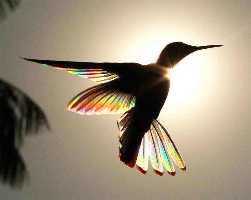
Some projects involve a lot more pixel pushing to accomplish than others. Golden Horizons had inspuration for a new logo and chose us to implement it. All they showed us was a beautiful photo of a bird flying in front of the sun! But the incredible multicoloured spectrums that shone through the birds outstretched feathers were unspeakably beautiful.
They wanted the bird to be the centrepiece of the logo with the focus being on those multicoloured feathers. What transpired was a truly Herculean manual tracing extravaganza with multiple attempts and vectors to get it right. In the end, each feather, each spine, and each tip had to be traced. A complex layering and masking was needed to make sure things looked right, and I was incredibly happy about how the gradients came out!
Use the slider to see the photo and the logo created from it!
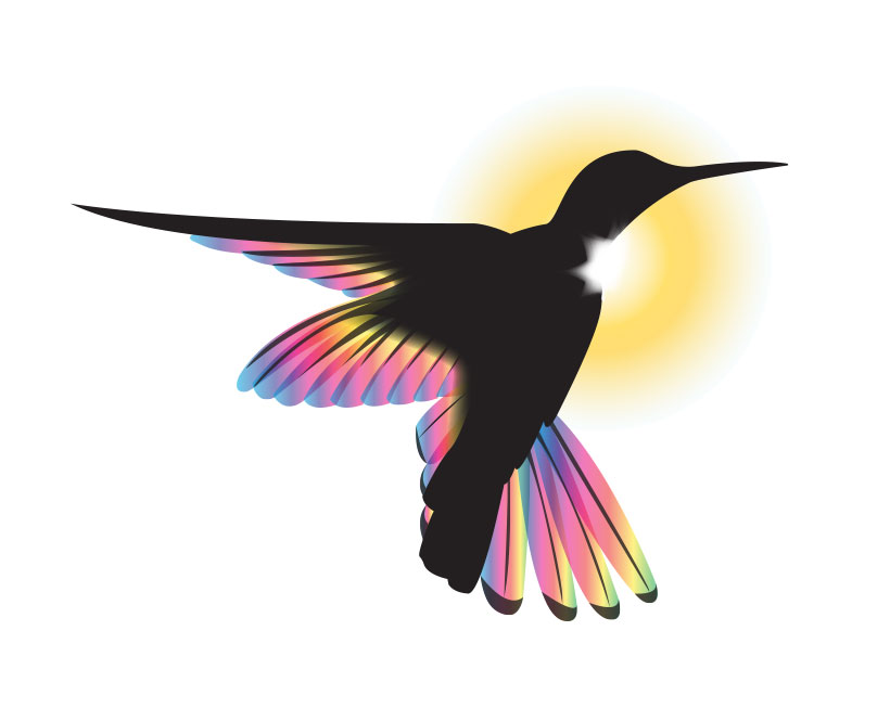
Final Logo
Though the meat and potatoes of the logo was that beautiful board, we needed a distinctive text treatment or the company name. So as not to overpower anything, we went with a simple serif font that gave a certain regal feel. The addition of a peaked pin line provides a visual break and something that evokes a horizon for the sun next to it.
![]()
The horizontal layout of the logo lends itself to easy placement on business cards and website mastheads. They can be contact here.
If you are interested in seeing what The Stem Creative can do for your logo idea, contact us!
Facebook Comments