


I’ve done websites for practically every business type.. but when I was approached by local author Judith Millar, I realized I’ve never done an author website!
Working In A Literary Creative Space
It was rewarding to work with someone who writes creatively. I’ve always loved talking with fellow creatives about their inspiration, and I was honestly surprised at how abstract Judiths visions were. She saw inspirational patterns in beach sand, emotional impact in certain types of trees, all tying back to the setting of her main novels.
This allowed me to be a little more artsy with my concepts, I didn’t have to worry about conforming to a certain preconceived vision of a modern website. But, as it turned out, even my first concepts were too conforming… I had to break out of the box.
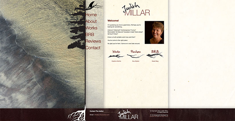
The most important elements were the fir trees from the setting in her book, and a raven or crow that is featured in her artwork. I got thinking, why don’t we make the navigation part of the tree?
I feel what I came up with balanced ease of use and creative implementation. As you’ll see on the site, we used half a silhouette of the fir tree, then hung the links off the other side in an oversized, thin, sans-serif font. The roots of the tree reach into the “soil” of the footer element. Our raven perched on a gnarly tree branch at the top. We carried on the branch element throughout the site to denote buttons.
We had trouble with the background though, nothing really seemed to click until she showed me dozens of photos she’d taken in the books settings. Beautiful water themes, sculpted beach sand, play of light all brought fought for attention… so I figured let’s use them all! As a result each page has it’s own unique background! They are also best viewed on a large display to get the full effect.
Other web developers may scoff and say I’ve increased the overhead unnecessarily, but this site gave me the opportunity to have a bit more creativity.. and overhead be damned.
The Rest Of It
Not a whole lot of content, just some simple links to buy her books via PayPal, and some styled block quote elements. The mobile version of the site is stripped back graphically so load time are faster, and our tree and crow elements are integrated into the logo.
This was a beautifully simple website that allowed me to exercise a little more creativity with design, a refreshing change!
With a few other sites on the go, I’ll be launching my 120th site very soon! Would you like to be 121? Contact us!
Facebook Comments