


You sit up in the middle of the night, cold sweat on your bro. You reach for the pen and paper on the night table, and the smile spreads across your face. You scribble furiously as you loudly proclaim, “I’m a GENIUS!”. A groggy “…ok dear..you sure are…” barely registers as your brain runs through the details of your amazing, fantastic, huge, incredible, stupendous idea. You’ve got it, a great product that has the potential to guarantee your retirement on a sandy beach… but though you can invent such a thing… you can hardly draw a stick figure. What about marketing? How do you sell it, what about package design even?
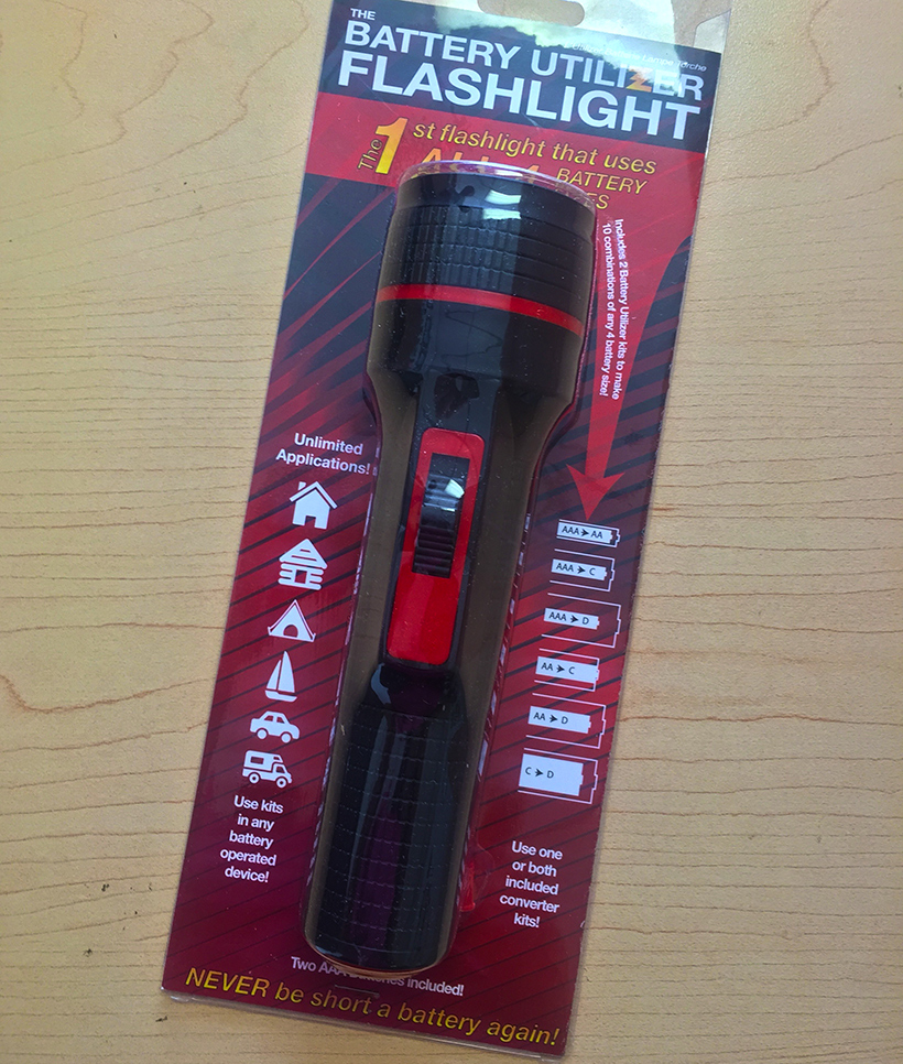
I’m sure a much less dramatic event happened to a new client of ours, but he did indeed come to the same conclusion.. if he wanted to sell his products with the big boys he’d have to level up his package design. After a couple of meetings to gain direction, we came up with what he thought was a fantastic solution! What the client came up with for his initial rollout is below.. swipe from the right to reveal what we managed for him!
Package Design is Very Important
Most folks that come up with a fantastic idea tend to focus on the product itself; not on how to market or package it. They will spend hours sweating the details of how it works and the quality of it’s build, but then when it comes to the marketing, are simply satisfied with a mediocre design that can in fact hurt their sales. Package design works on a sub conscious level and like it or not, will imprint it’s perceived quality upon the product.
Why do you think companies like Apple spend so much time and money on its product packaging?
You may not care consciously, but if your iPhone came packaged in a wrinkled bag with a dotty printed black and white paper folded in quarters… you would not perceive it as the quality it actually is.
Designing For Command Electrical
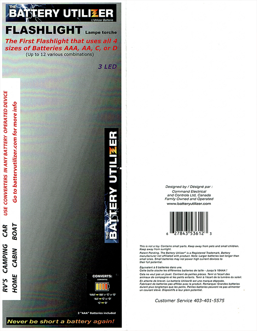
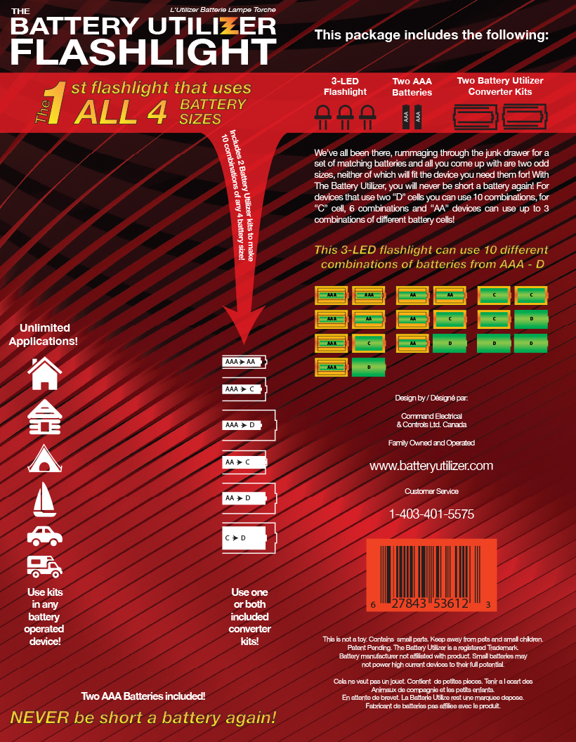
Very rarely do we get a client that is so open to our design suggestions, it allows us a great degree of freedom. Command Electrical was such a client. We want to start with finding a way to communicate visually what the core of his product does; that is the two converter kits that are his patent invention. They are capable of converting any size battery to a larger size. For example, you can make a AAA fit within a device that uses D cells. Using actual measurements, we worked out an iconography that communicated this use. We also made a colour version that eventually found use on the back.
The flashlight product itself is a black model with red trim, so we choose to flip this ratio for contrast in our background. His product title was more integrated and we used his gradient with enhanced typography in the tag line to draw the eye. An arrow was used to draw viewers to further information on what the product actually does. Instead of words, we used common symbols to communicate its various applications.
The back on the original was very underutilized, so we took the opportunity to tell customers what exactly is contained in the package and explain how the device works using a “Plain Folks” advertising method. A colourful chart is used to display the many combinations of batteries the product can use. Even the UPC code was integrated better by using a red background.
Effective Packaging
The new packaging communicates through typography and iconography it’s purpose in a quick visual scan. This should effectively piqué interest and draw people to pick it up and take a deeper look.. hopefully leading to more sales!
Our client is very happy with the results and we can’t wait to see his product next door at Bowness Auto! You can see the product and a demonstration on Youtube here.
Facebook Comments